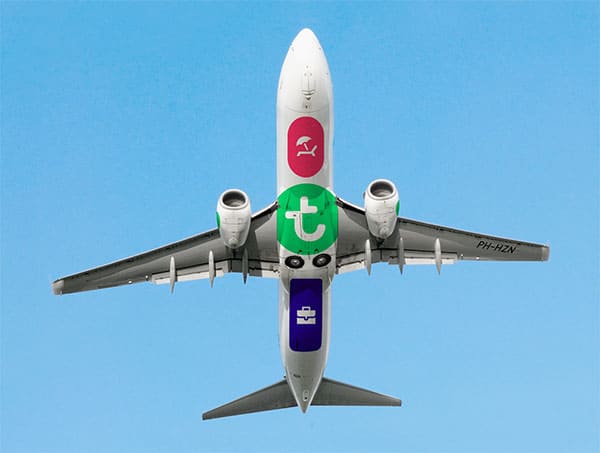
Amsterdam, January 26th.
Low-cost airline Transavia launched their new brand following a collaborative project between two Dutch agencies: Mirabeau, the Netherlands’ leading digital marketing agency, and internationally acclaimed design firm Studio Dumbar. The new branding expresses Transavia’s commitment to become Europe’s leading airline in hospitality – in the air and online. The company will focus on appealing to business as well as leisure travellers and will grow in size.
The hospitality of Transavia’s crew has always been a key competitive advantage and plays an important role in the high loyalty rate of clients. The new strategy builds on this heritage, taking it a step further by managing and communicating it more explicitly. Part of the Air France-KLM group, Transavia operates from six home bases in The Netherlands and France, including its main bases in Amsterdam (Schiphol) and Paris (Orly). Already a serious player on the continent, Transavia will continue to expand the number of cities it serves in Europe.
Online and offline
Although airplanes are the most dominant image of an airline, Transavia’s audience experience 70% of the brand online. The vast majority of tickets are sold online: an area that continues to grow. Consequently, the re-brand was an integrated process combining company strategy, e-commerce and brand design. With Mirabeau, Transavia began work on a new e-commerce platform enabling Transavia to radically increase ancillary sales, improve the conversion of flights and reduce operational costs. They concluded that it would be necessary to redefine Transavia’s positioning and visual identity, in accordance with the e-commerce strategy and concept developed by Mirabeau. Directed by Transavia’s Chief Marketing Officer Roy Scheerder, Mirabeau and Studio Dumbar worked together as one team.
Heritage
The new design acknowledges the brand’s heritage – the company colour remains green and the logo is still based on the letter ‘t’ in a round shape. Both elements have been redesigned and are part of a complete new visual branding. Due to its strategic importance, the design was thoroughly pre-tested in five European countries; the results clearly confirmed that the new design answers Transavia’s strategic objectives.
The key to Transavia’s positioning is summarized as “It’s a pleasure”. This is not an external pay-off, but a leading principle for the company. The main objective is to offer and express hospitality and service in a manner that appeals to both leisure and business audiences. The design is playful, accessible and flexible, adapting easily to the diversity of physical and digital media.
Custom-designed icons are used to communicate across cultures and languages in a simple and appealing way. One special feature is the application of icons to the underbelly of Transavia’s planes, with a different combination of icons for each plane in the fleet. Another symbolic livery feature appears next to the entrance, where the word ‘Welcome’ is written in all the languages of the countries served by Transavia. Rather than only communicating to a large audience at a distance, this allows the airline to communicate directly with each individual passenger. This unique feature underlines the drive of the company.
Transavia will implement the new brand in a gradual, cost-effective manner. The new e-commerce platform will go live this summer. The new brand design will become increasingly visible in the coming months, beginning with the new livery design that is now visible on Transavia’s new Boeing.


